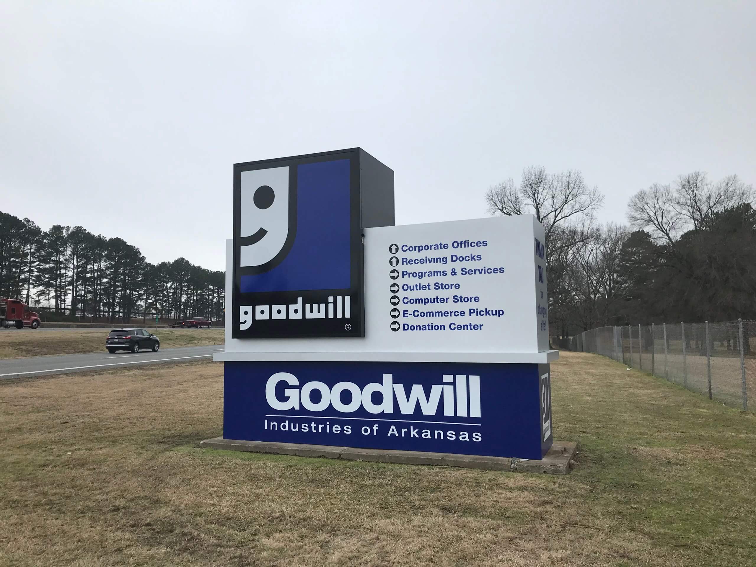
Tips and Tricks for Effective Monument and Building Signs
If someone asked you to make a list of valuable marketing tools, chances are good that you’d jot down SEO strategy, social media marketing, and other examples of digital marketing strategy. It’s true that these are all incredibly important tools for running a business– but all too often, people forget about the importance of “real life”, brick-and-mortar marketing strategies.
Market your business offline, too.
How did people find out about local businesses before the internet, or even before the phone book? (Do they still make those)? Simple– they utilized the businesses within their communities. Even today, you’re likely to frequent places that are located close to your home, just due to their proximity.
How did you find the places located close to your home? That’s right– their signs! Without clear and effective monument or building signage, you probably wouldn’t have known those places existed, even if they were right next door.
Develop a brand identity.
Brand identity is just a combination of the visual representations of your brand across all the contexts in which it’ll be used– logos, wordmarks, colors and fonts, materials, accompanying imagery, and more. Developing a brand identity can help you keep things visually cohesive, which makes your business identifiable and memorable to customers.
When designing the signage for your business, you should adhere as closely as possible to your established brand identity. If you already have a recognizable brand identity, making sure that your sign reflects that will make it much easier for existing and potential customers to locate your business!

Pay attention to messaging
Because people will typically see your sign just for a split second as they drive or walk by the building, it’s imperative to keep your message as clear and simple as possible. Essentially, people should be able to fully grasp your message at a glance.
In addition to keeping the message simple, you should also make sure that the design is simple! Use text that’s visible from a distance– no highly decorative fonts! Pay attention to the spacing, too– even the very best font can be rendered unreadable with incorrect letter and line spacing.
Stick to what really matters. Use as little imagery and text as possible so that the sign stays accessible even at a quick glance. Simplicity and clarity should be your design goals!
Use appropriate colors and contrast
Color selection plays a big role in the visibility and impact of your signage. Of course, you should stick with colors that align with your visual brand identity, but you should also make sure that those colors translate well to an exterior sign. Contrast is key– without it, people just won’t be able to read your sign, especially from a distance!
Plus, consider how the sign will look at different times of day. A sign that looks good during the daytime might be difficult to read at night.
Incorporating illumination might also be a big help here. If your business operates at night, or if you’d like people to be able to locate your building at any time, utilize internal illumination in your monument or building sign, use spotlights, or experiment with backlighting.
Consult the pros
When it comes to designing beautiful and effective monument and building signs, your best bet is to consult the experts– like the designers here at Pinnacle Signs. We’ve created memorable and visible signs for all of our satisfied customers, and we’d be happy to help you, too. Just give us a call today to get started.

services

Website design by Rock City Digital
